Un-Designing Data Tables: A Case for Denser and Dumber
My first initiative at Rabbet, a real estate financing startup, was to make sure each piece of data didn’t only look nice, but was functional, accessible, and useful — and that meant making it ugly.
Yes, I'll admit it. When I was a finance due diligence intern at a public accounting firm, I groaned when we were mandated to listen to new software pitches from visiting startups. I loved Excel. A single sheet could be packed with information. Columns and rows were workable, moveable, customizable, and so much more, with just a few taps on the keyboard.
But I also loved Dribbble. Oh man, was it satisfying scrolling through brightly colored blobs layered in between polished lines of Futura. Smooth gifs of cards, cards, and more cards, swiping left and right to reveal thin line graphs then rainbow donut charts. Oh, and white space. So much white space.
So, I Dribbble-ed and Pinterest-ed my way through the first iteration of the new dashboard.
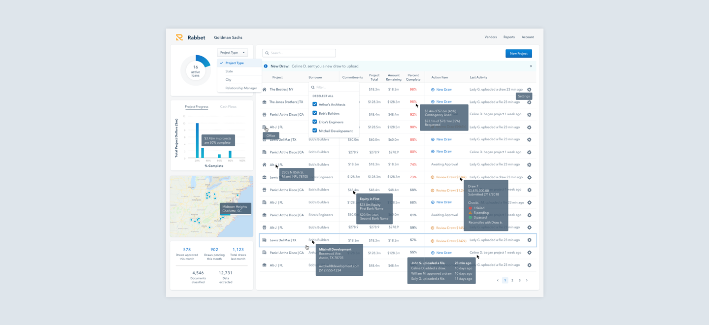
As a contractor at the time, this was my first iteration of a dashboard redesign for the company. The CEO was ecstatic about the new look — I knew he would, because he contacted me through Dribbble, initially. At first glance, this mockup seemed chock full of information.

Upon closer inspection, however, I’ve only been able to put five columns on the entire table.
While the CEO and the sales teams were on board, the engineers and customer success teams were not as quick to give go-aheads.
- There were so many bespoke components that didn't exist on the platform. It would be heavy engineering lift — and I hadn't considered if some of these data points even existed right now in the system.
- Number by number, our customer success team would ask me to add more and more data into this view. There seemed to never be enough that could be crammed on one page.
Even so, I had this clean, flat, minimal vision stuck in my head.
There's a reason this dashboard didn't make it into the backlog until I took my finals, graduated, island-hopped through Thailand, ate my way through Japan, flew back, fell ill with 3 strains of E. Coli, and began working full-time. It was simply unreasonable.
By then, they had finally hired a seasoned Senior Product Designer, who pushed me to really think about what I was designing.
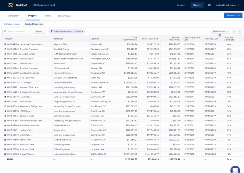
- Adam the Accountant does not care that Column 1 and Column 2 are 40 pixels apart. He does not know, however, how to scroll horizontally.
- Lisa the Loan Administrator does not want to see the same data as Celine the CFO. To accommodate, we needed maximum data display and customizable functions.
- We were a startup of just over 20 people. If it was too much work to implement, it would never be prioritized.
I needed to design for someone who didn’t want to let go of Excel.

All our user really needed was to:
- filter, sort, group, and search rows
- customize and save column views
- (buggy) bulk select and export
- that's it.
None of this was novel — I had spent almost 80 full working hours designing skinny Excel.
However, I knew that this was not only functional, but something I personally might have used while I was manually filing documents at my accounting gig. The tables were pushed through to engineering and approved by the business side, and within a month, we began seeing the changes in development.
- Each page had different major purposes, but because our tables were easily customizable, engineers were able to create one, single cascading Table component and copy it throughout the system with different defaults.
- Our customer success team was able to field almost every support question. If a user asked if we are able to report the list of W using X, grouped by Y, and sorted by Z — we showed them on the spot how to change the table to reflect exactly that.
The feedback?
Since our customers are very few and very high-touch, our best (and really only meaningful) feedback comes directly in the form of spoken word and quickly-drafted emails.
But, in my opinion, two good words from a real estate financing industry professional — some old guy who had trouble finding the "x" on a popup but needs to reconcile more than 200 documents for a $50 million construction loan all on our platform — is worth a thousand 5-star reviews:
